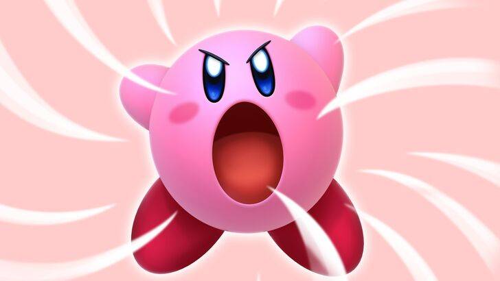
Nintendo Staff Unveil Secrets of 'Angry Kirby'
Author : Zoe
Feb 23,2025
Exploring the Evolution of Kirby's Image: From "Angry Kirby" to Global Consistency
This article delves into the fascinating story behind Kirby's varying appearances in Western and Japanese markets, as revealed by former Nintendo employees. We'll examine the localization strategies employed, the shift in marketing approaches, and Nintendo's evolving global strategy.
The "Angry Kirby" Phenomenon: A Western Marketing Strategy
Kirby's portrayal in Western markets often featured a more determined, even "angry," expression on game covers and promotional materials. Former Nintendo Localization Director, Leslie Swan, clarified that the intent wasn't to depict anger, but rather to convey a sense of resolve, a characteristic deemed more appealing to Western tween and teen boys. This contrasts with the Japanese market, where Kirby's inherent cuteness remains a significant draw across all age groups, as noted by Kirby: Triple Deluxe Director Shinya Kumazaki. While the "tough Kirby" approach resonated in certain titles like Kirby Super Star Ultra, the core appeal of the character's inherent charm remained paramount in Japan.
Marketing Kirby: Beyond "Kiddie" Games
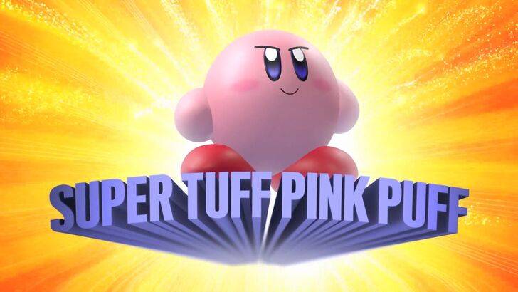
Nintendo's marketing shifted to broaden Kirby's appeal, particularly among boys. The memorable "Super Tuff Pink Puff" campaign for Kirby Super Star Ultra exemplifies this strategy. Former Nintendo of America Public Relations Manager, Krysta Yang, highlighted Nintendo's desire to move beyond the "kiddie" label often associated with the company and its games during that era. This led to a conscious effort to emphasize the combat aspects of Kirby games, aiming for a more mature image. While recent marketing focuses more on gameplay and abilities, the perception of Kirby as predominantly "cute" persists.
Localization Differences: A Look Back at Early Kirby Games
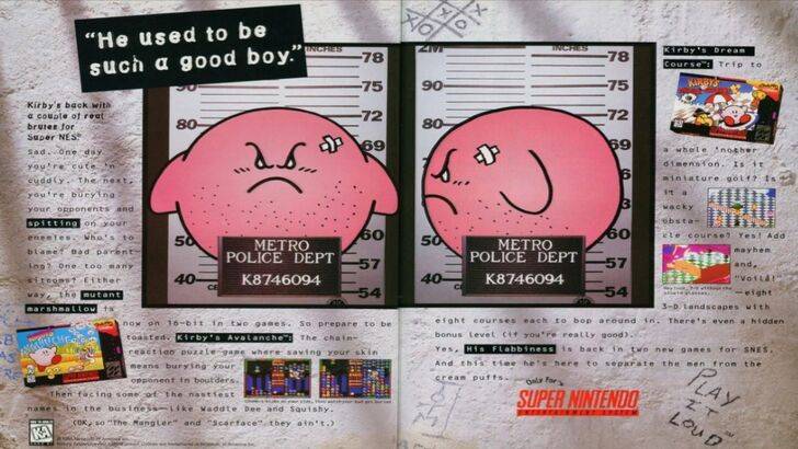
The divergence in Kirby's image between Japan and the U.S. is evident in early releases. The infamous 1995 "Play It Loud" advertisement, featuring Kirby in a mugshot, is a prime example. Subsequent game box art often showcased Kirby with sharper features and more intense expressions. Even the color palette differed; Kirby's Dream Land's U.S. release featured a ghostly-white Kirby, a decision influenced by the Game Boy's monochrome screen, which contrasted with the original pink hue. This early experience highlighted the challenges of marketing a "puffy pink character" to a Western audience seeking a "cooler" image.
A More Global Approach: Consistency and Brand Identity
Both Swan and Yang agree that Nintendo has adopted a more unified global approach in recent years. Closer collaboration between Nintendo of America and its Japanese counterpart has led to more consistent marketing and localization strategies. The company is moving away from regional variations, aiming for a more unified brand image worldwide. While this global consistency offers benefits, it also risks overlooking regional nuances and potentially leading to less distinctive marketing. The evolution of the industry, increased awareness of Japanese culture in the West, and the growth of a global audience have all contributed to this shift.
Latest Articles
Unveiling the Enigma: Xbox Announces Game Reveal on January 23
Next week's Xbox Developer Direct will showcase four games, with the identity of the fourth remaining a secret. Hints suggest it's a new installment in a renowned Japanese franchise.
Xbox's Developer Directs, launched in January 2023, have become highly anticipated events, offering developers a dir
Monopoly GO Juggle Jam: Unlocking Rewards After Completion
Quick Links
What Happens After Completing All Juggles in Monopoly GO?
What Happens To Extra Carnival Tokens After Juggle Jam Ends?
Monopoly GO's Juggle Jam, hosted by Peg-E, is an engaging mini-game where players predict the order of colored balls. Successful guesses earn Carnival Tickets, re
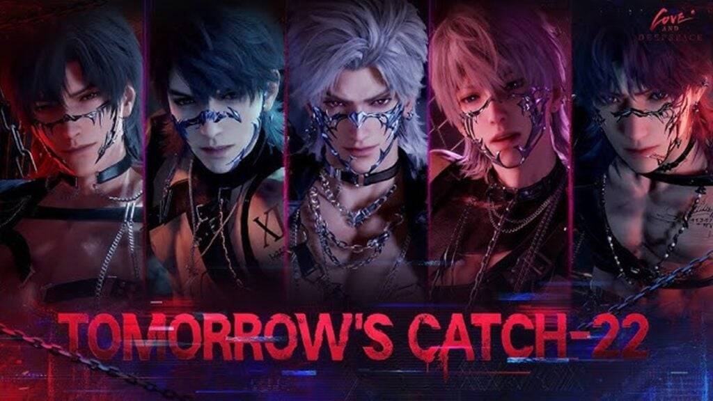
Tomorrrow's Catch-22 Event in Love and Deepspace
Love and Deepspace's highly anticipated Tomorrow's Catch-22 event is back! Running from February 10th to 26th, this event offers players exciting high-stakes missions and valuable rewards.
Tomorrow's Catch-22: Exclusive Rewards and Gameplay
This event features the coveted all-character 5-Star Memor
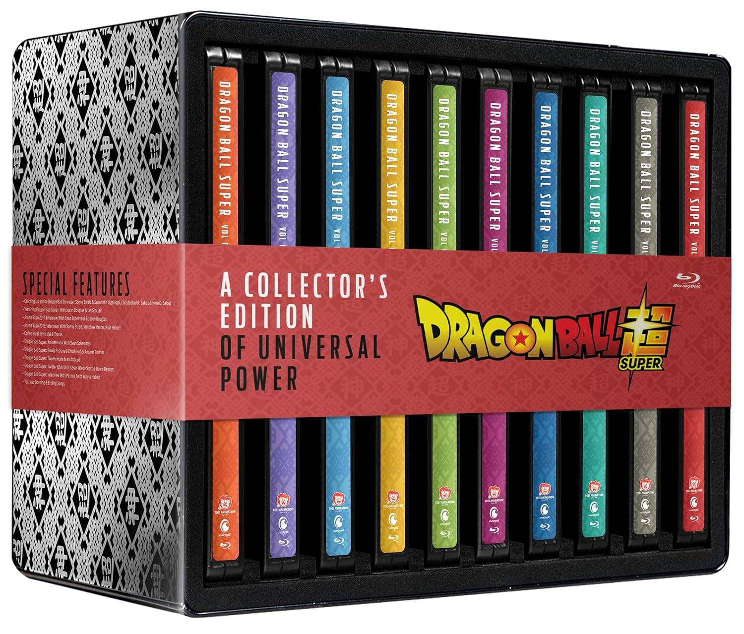
Dragon Ball Super CE Plummets to Lowest Price
Amazon's price drop on the limited edition Dragon Ball Super: The Complete Series steelbook Blu-ray set makes this a steal for collectors. Currently priced at $120.99 (39% off the $199.98 MSRP), this 20-disc set containing all 131 episodes is housed in 10 stylish steelbooks. This is the lowest pri
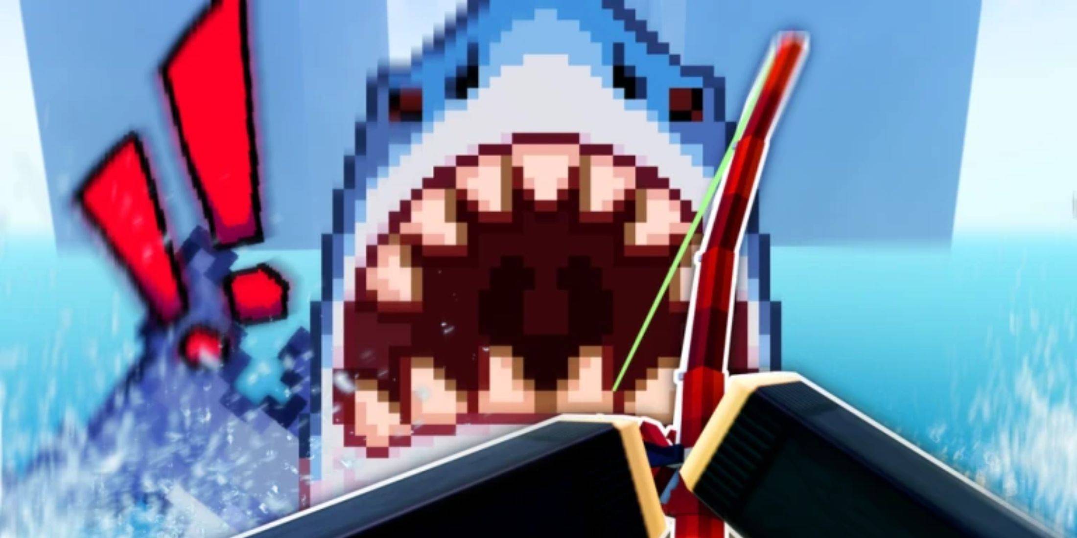
Roblox: Seaside Codes (January 2025)
Quick Links
All Seaside Codes
Redeeming Codes in Seaside
Finding More Seaside Codes
Seaside, a relaxing Roblox fishing game, lets you unwind by casting your line and reeling in your catch. A simple minigame ensures you don't lose your fish! Sell your bounty for in-game currency (Fishbux) and earn
Cobra Kai Season 6: Part 3 Delivers Epic Showdown
Cobra Kai's final chapter, arriving in three parts, concludes its epic saga with its sixth and final installment. Part 3, encompassing the final five episodes, lands on Netflix on Thursday, February 13th. This spoiler-free review assesses the impact of these climactic episodes on the overall series
Latest Games

Sweet Home
Casual丨80.6 MB

Infinite Arabic
Educational丨16.1 MB

Mania Screw
Casual丨83.3 MB
Scary Music Beat Maker
Casual丨175.7 MB

Tap Tap Hero 3: Piano Game
Music丨117.9 MB

Mochicats Collection
Casual丨178.4 MB
Block Continuous Elimination
Casual丨62.1 MB
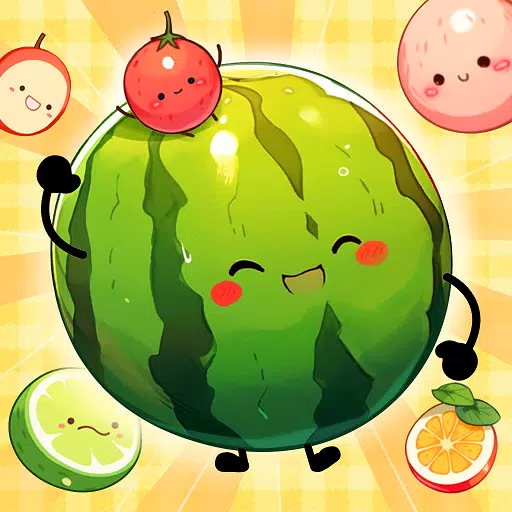
Watermelon Merge Game
Casual丨71.8 MB
Trending Games
MORE +
![Salvation in Nightmare [v0.4.4]](https://imgs.21qcq.com/uploads/36/1719555347667e551321c26.jpg)


Top News
MORE +
01
12-11
Disney Mirrorverse Ends Service This Year
Disney Mirrorverse, the mobile game that brought together an epic mashup of Disney and Pixar characters in a brand-new universe, has announced its EOS. Kabam, the company behind the game, just announced that they’ll be pulling the plug on December 16th, 2024.As of today, the game has already been pu
02
12-11
Pokémon GO Celebrates 8 Years with Exciting Raids and Bonuses!
Pokémon GO is celebrating its 8th anniversary with a week-long extravaganza! The festivities begin Friday, June 28th, at 10:00 a.m. and conclude Wednesday, July 3rd, at 8:00 p.m. Get ready for exciting new Pokémon debuts, boosted event bonuses, and enhanced raid and trading opportunities.
Here's a
03
11-14
Dead by Daylight is Officially Adding Lara Croft
Lara Croft is officially coming to Dead by Daylight, Behaviour Interactive has announced. It had long been speculated that Tomb Raider's protagonist would be joining Dead by Daylight's Survivor roster soon, but Behaviour has now put the rumors to rest. Just over a month after the release of
04
12-17
New Event: Seek Lost Fragments in Boxes
Boxes: Lost Fragments is launching a new in-game puzzle event! This event challenges players to unlock all 12 hidden achievements, revealing the game's deepest secrets.
Boxes: Lost Fragments, developed by BigLoop and published by SnapBreak, initially debuted on Steam before expanding to mobile plat
05
11-18
Play Together introduces new dragon-themed content and more in new collab update
Play Together is getting a major new update featuring, what else? DragonsIt's part of a collaboration with their own subsidiary Highbrow and their game Dragon VillageYou'll be able to get your own dragon pet, exclusive cosmetics and moreCasual social game Play Together is introducing new dragon-them
Topics
More +